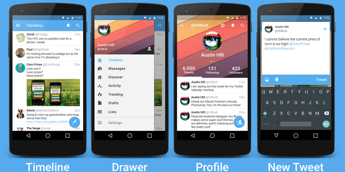
After a testing period that lasted several weeks, Twitter has officially announced the redesign of its client for Android. Version 6.0 will not add new features to those already present, but will provide a better user experience across a clean and organized graphical interface. All naturally quite clearly following Material Design guidelines, the design language introduced by Google with Android Lollipop.
With this change, navigation within the various features of the social network is secured by four separate tabs: Timeline, Moments, Notifications and Messages. The user can switch tabs by pressing the buttons on the interface, either by sliding your finger to the right or to the left. In addition becomes the "floating" button to write new tweets, placed in the right bottom as usual for applications designed for Material Design.
Scrolling in the top bar, the screen is hidden, leaving more space for content on the screen. However, the bar contains four buttons to access the tabs and they will be visible at all times. Clicking on the image in the upper left part of the profile you have access to a retractable page that contains a variety of options, including switching to another account, but also the application settings and more options.
Even this particular application function can be called with a gesture, moving your finger across the screen from left to right. Icon in the top right find the magnifying glass that will allow us to perform a search within the social network. As we said at the beginning of the article, everything else has remained largely unchanged compared to previous versions, since no new features to add.
This version also includes the introduction of an automatic night mode activation that could come with stable release in a few weeks. According to the article published by Twitter, with version 6.0, Material Design is currently being implemented around the world and should soon be available for all users.
