YouTube, along with Google Maps and the Google application, is one of the applications of the Mountain View company that receives the greatest number of improvements and visual changes. The latest update, which is being deployed on some Android smartphones as well as Pixel C, looks more like the YouTube version for iOS than the previous one.
The main novelty is in the navigation bar, which has moved to the bottom of the screen, more accessible for the thumbs. With this movement, some substantial changes are added. The Account tab now includes an option called Library and the avatar icon has been moved to the upper right corner instead of the accessible menu with three ellipses.
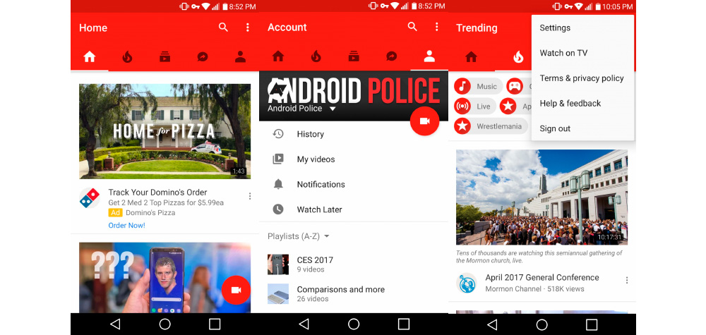
The update of the graphical interface also affects the version dedicated to the tablets, as shown by the screen of the Pixel C. The style is also very similar to iOS, this time to the version for iPad, of course, although it is possible that observe small differences, mainly on the History screen.
In Android we find an interface that mimics that of iOS smartphones, with a full screen and whose space on the right is used to show previews. Google will probably further refine the look of your application in different versions, to make it even more functional.
The video camera icon, which allows you to quickly upload your videos, has moved up next to the icon of your account and instead of the house now appears the text of YouTube at the top of the window. This removes the redundancy that would be created with the word Home in the navigation bar.